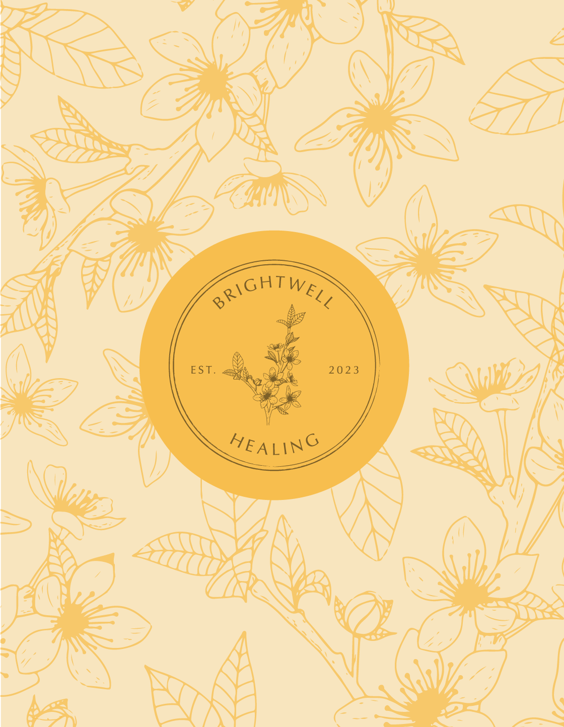
Brightwell Healing
Scope of work:
brand strategy - brand identity - web design - printed materials
BRAND WORDS: Professional / Nurturing / Compassionate / Hopeful
Brightwell Healing offers personalised Bach Flower Remedy consultations to support emotional and spiritual well-being. Founder Angie, with over 35 years of experience in counselling, sought a brand that would reflect the healing power of nature while remaining approachable and authentic.
The final identity achieved this vision by seamlessly blending nurturing and compassionate elements with a strong sense of professionalism. The brand’s rich deep green tones, vibrant accents, and delicate illustrations create a warm, inviting atmosphere that resonates deeply with her clients, reflecting Angie’s expertise and care.
Project Goal
Angie wanted a brand that felt authentic and genuine while reflecting the beauty and transformative aspects of the flower remedies.
As Tanya saw it:
After finalising the brand strategy, it was clear that we needed the Brightwell Healing brand to feel really nurturing, compassionate and hopeful - bringing in the joy and vibrancy of nature - but also balancing that with being super professional to reflect Angie's knowledge and expertise.
KIND WORDS
“I have just watched your brand strategy video! Amazing! Amazed at how well you have “got me”, and at how much work you have already put in and the research you have done.”
ANGIE, BRIGHTWELL HEALING
The Result
The final brand identity for Brightwell Healing beautifully combines a feeling of nurturing, compassion, and professionalism—exactly as Angie envisioned. The vintage-inspired script logo subtly references the ‘Bach’ logo, reinforcing her credentials as a registered Bach practitioner, while the inclusion of the Star of Bethlehem flower adds a meaningful and personal touch.
The use of a rich deep green colour combined with vibrant tones and delicate illustrations captures the joy and vibrancy of nature, making the brand approachable and relatable while also feeling grounded and professional. This cohesive and carefully crafted identity not only reflects Angie’s deep expertise but also creates a warm, inviting atmosphere that resonates with her clients.
KIND WORDS
“I would recommend Tanya for her ability to listen and tease out what you're looking for. Tanya really listened to what I wanted. She had a very detailed questionnaire which helped me to set out my vision. I asked if she could make me a website that would be like walking into a beautiful garden full of healing flowers, and she has done exactly that.”
ANGIE, BRIGHTWELL HEALING


